Environment shapes performance!
A brand identity for a corporate headquarters built on the belief that environment shapes performance.
MY Contributions
Brand Strategy,
Visual Identity,
Art Direction.
Timeline
Apr - May 2024
Brand Strategy,
Visual Identity,
Art Direction.
Timeline
Apr - May 2024
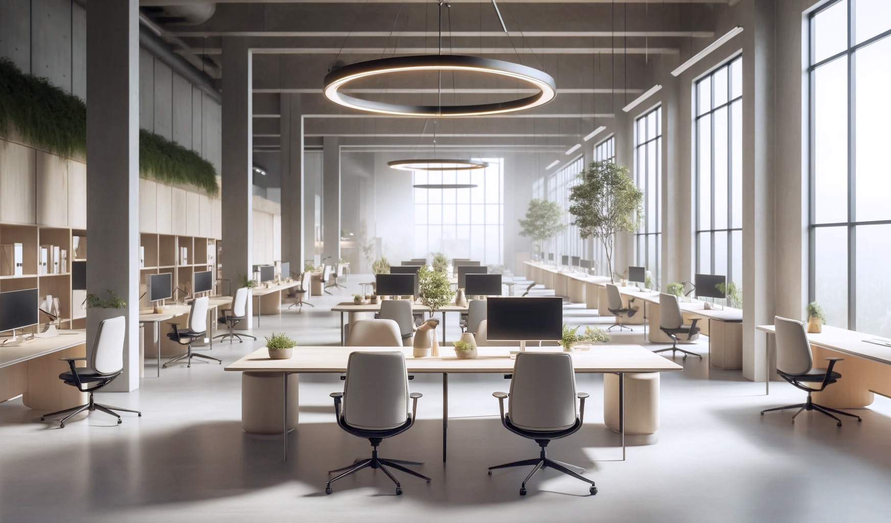
Headquarter is a Netherlands-based interior design studio redefining the modern workplace.
Their approach goes beyond aesthetics, creating environments that sharpen focus, encourage productivity, and introduce a sense of calm within the fast-paced rhythm of modern work life.
At Headquarter, we see space as a strategic tool, not just a backdrop for work. The environments people inhabit every day directly influence how clearly they think, how effectively they collaborate, and how sustainably they perform. Our philosophy is built on the understanding that productivity without well being is short lived. That is why we design offices that function with precision while also nurturing calm and mental clarity.
At Headquarter, we see space as a strategic tool, not just a backdrop for work. The environments people inhabit every day directly influence how clearly they think, how effectively they collaborate, and how sustainably they perform. Our philosophy is built on the understanding that productivity without well being is short lived. That is why we design offices that function with precision while also nurturing calm and mental clarity.
The Challenge
Designing the Mind Behind the Space
The challenge was to position Headquarter as more than an office design studio and define it as a curator of human experience. The brand needed to communicate that workplace environments actively shape clarity of thought, creative energy, and emotional balance, not only operational performance.
Brand Strategy
Research showed that most office design brands focus on functionality and efficiency, while emotional wellbeing and focus were rarely communicated visually. This insight shaped the positioning of the brand.
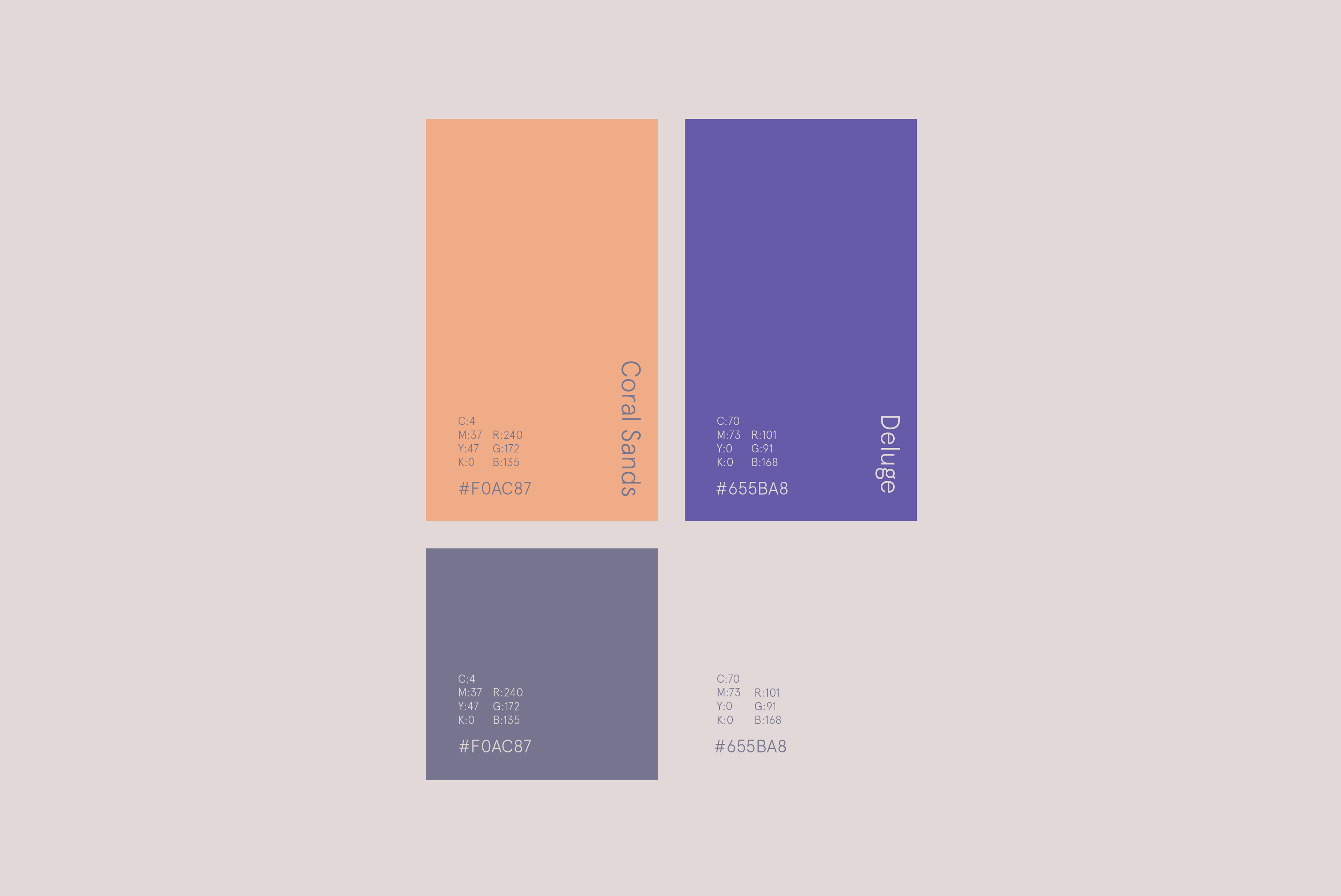
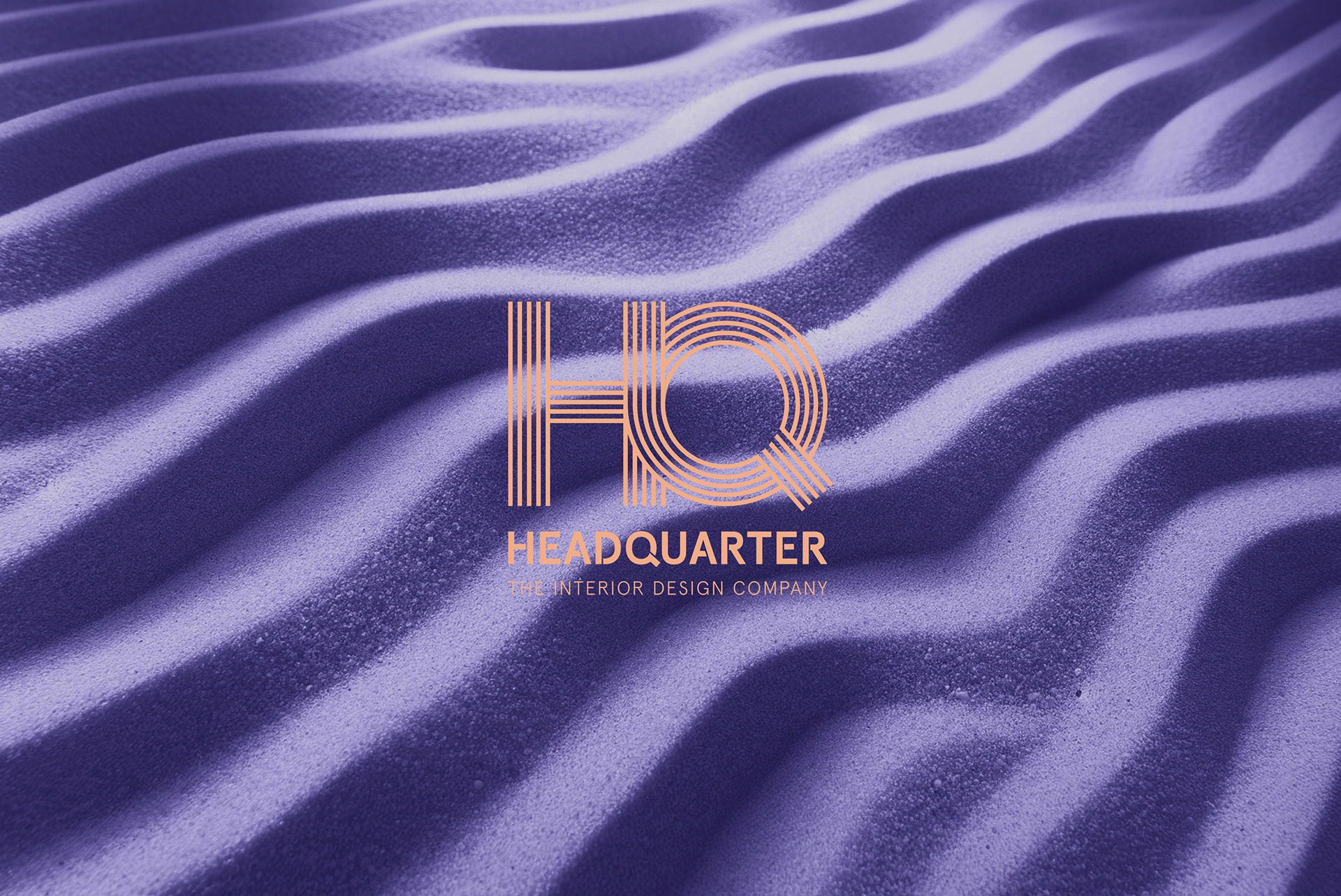
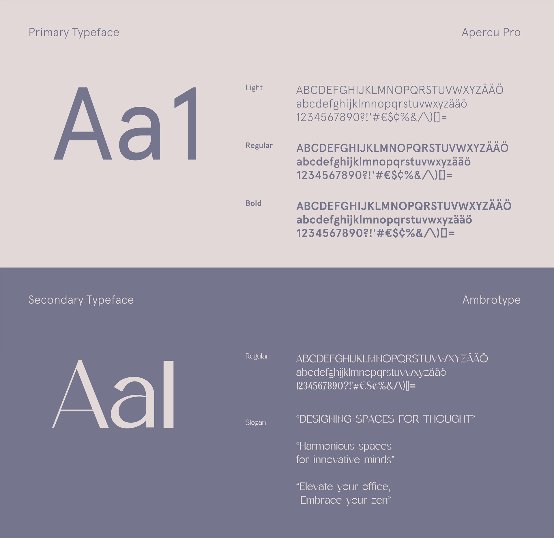
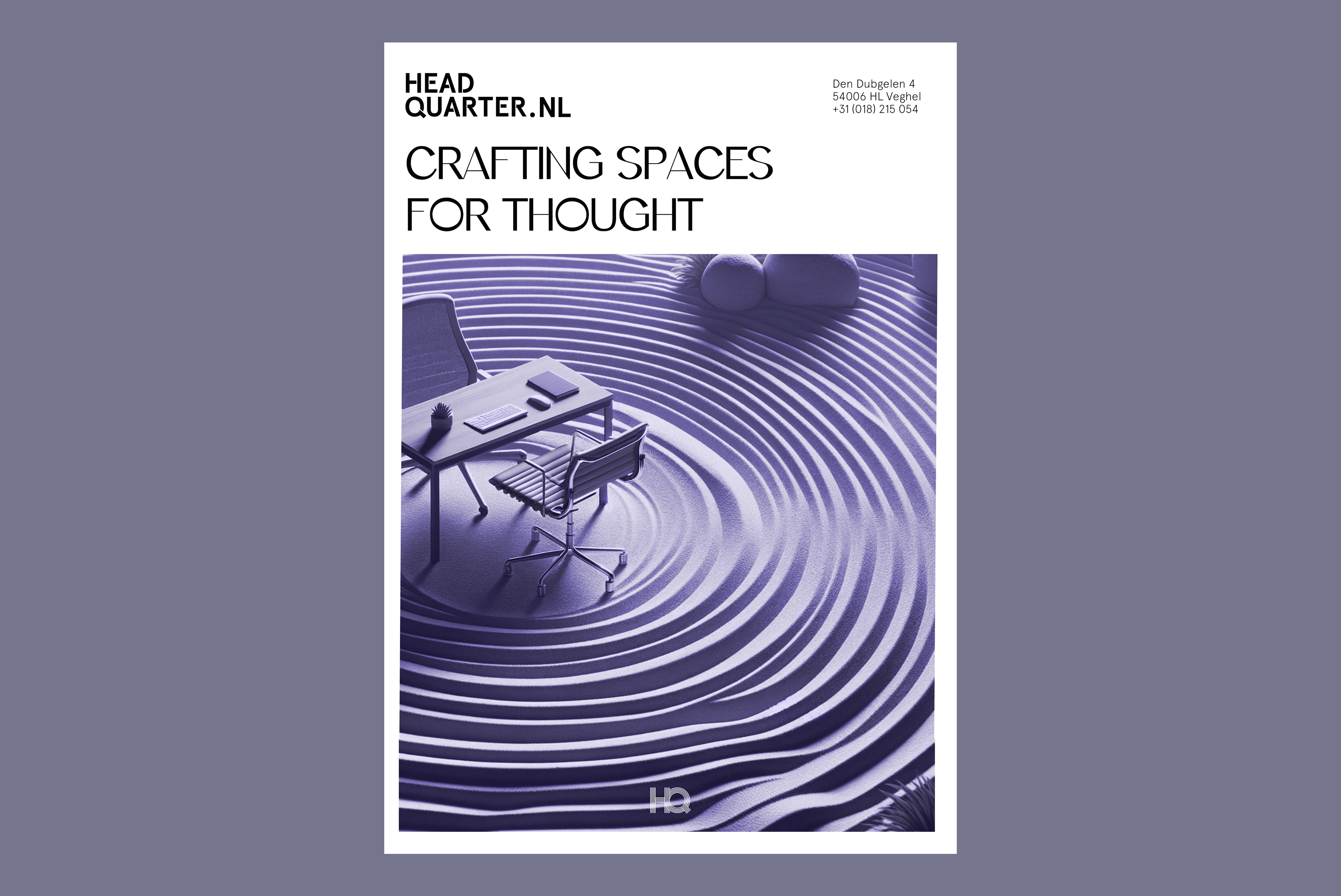
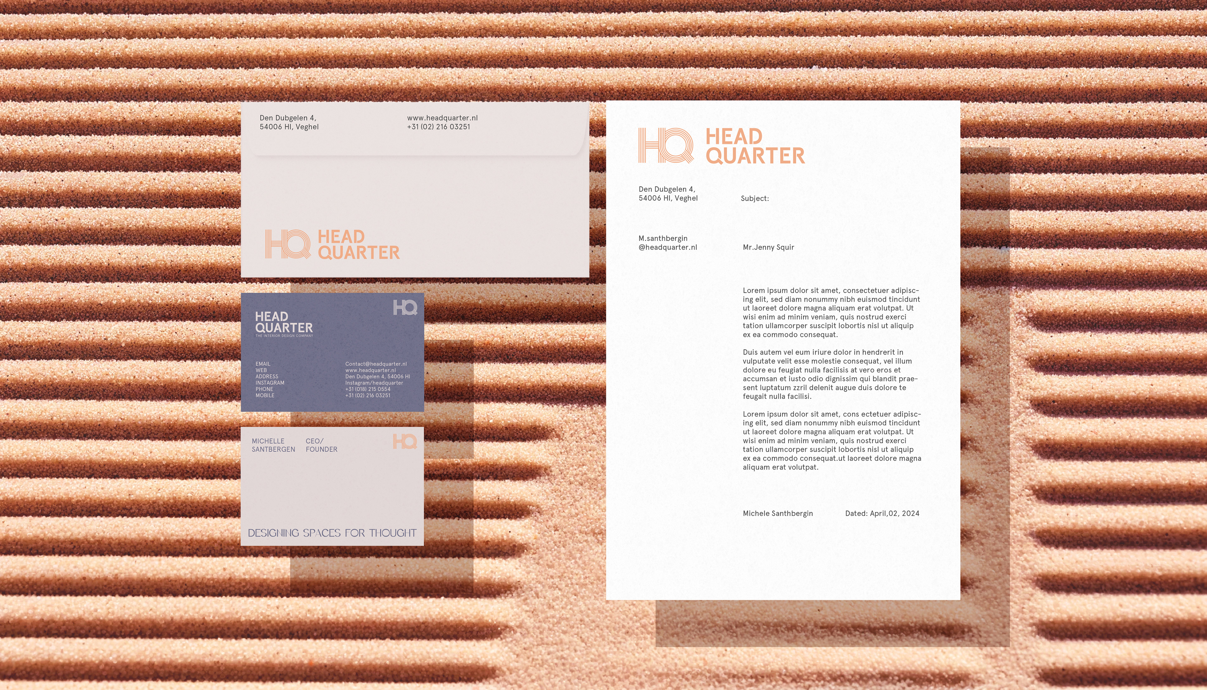
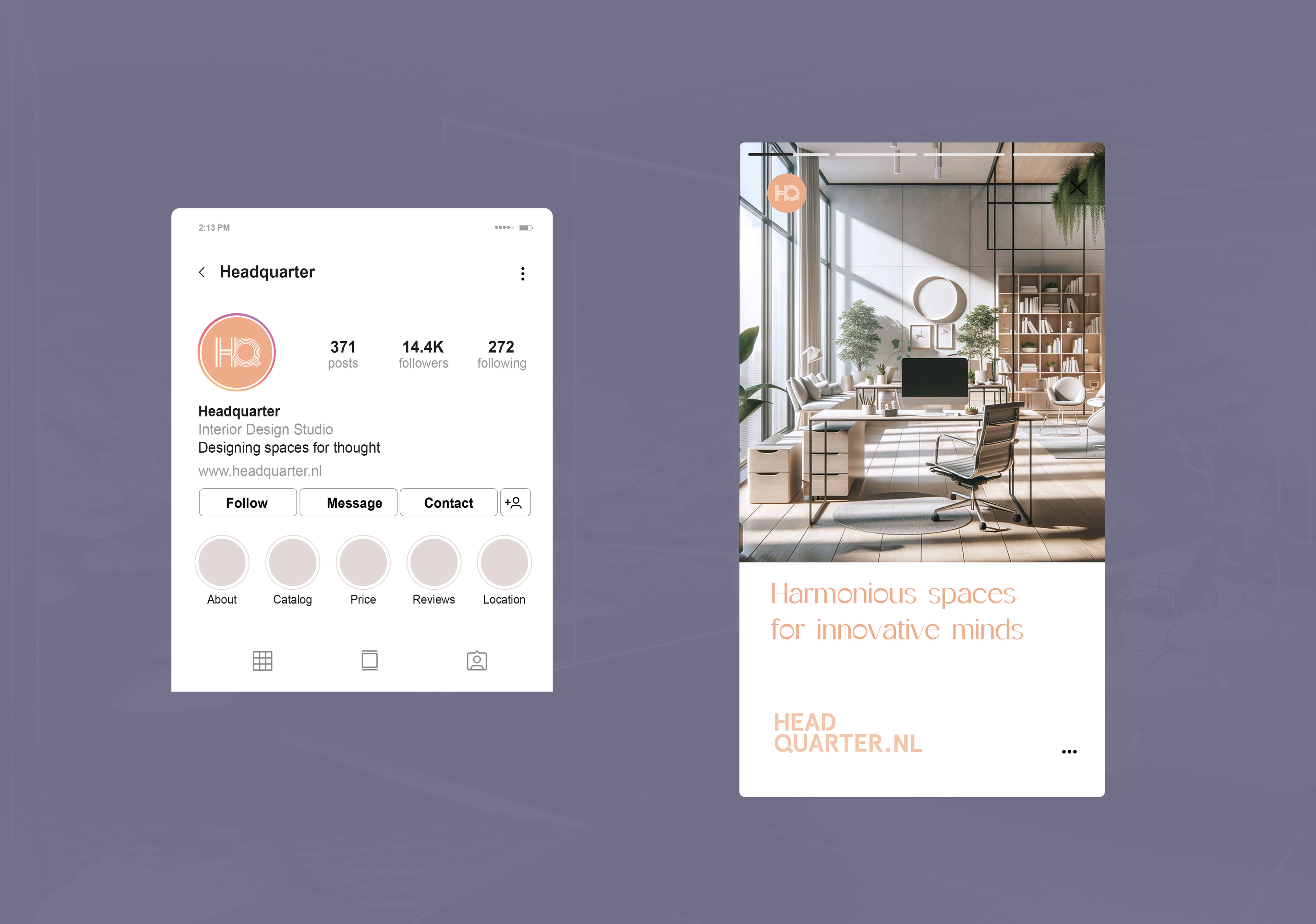
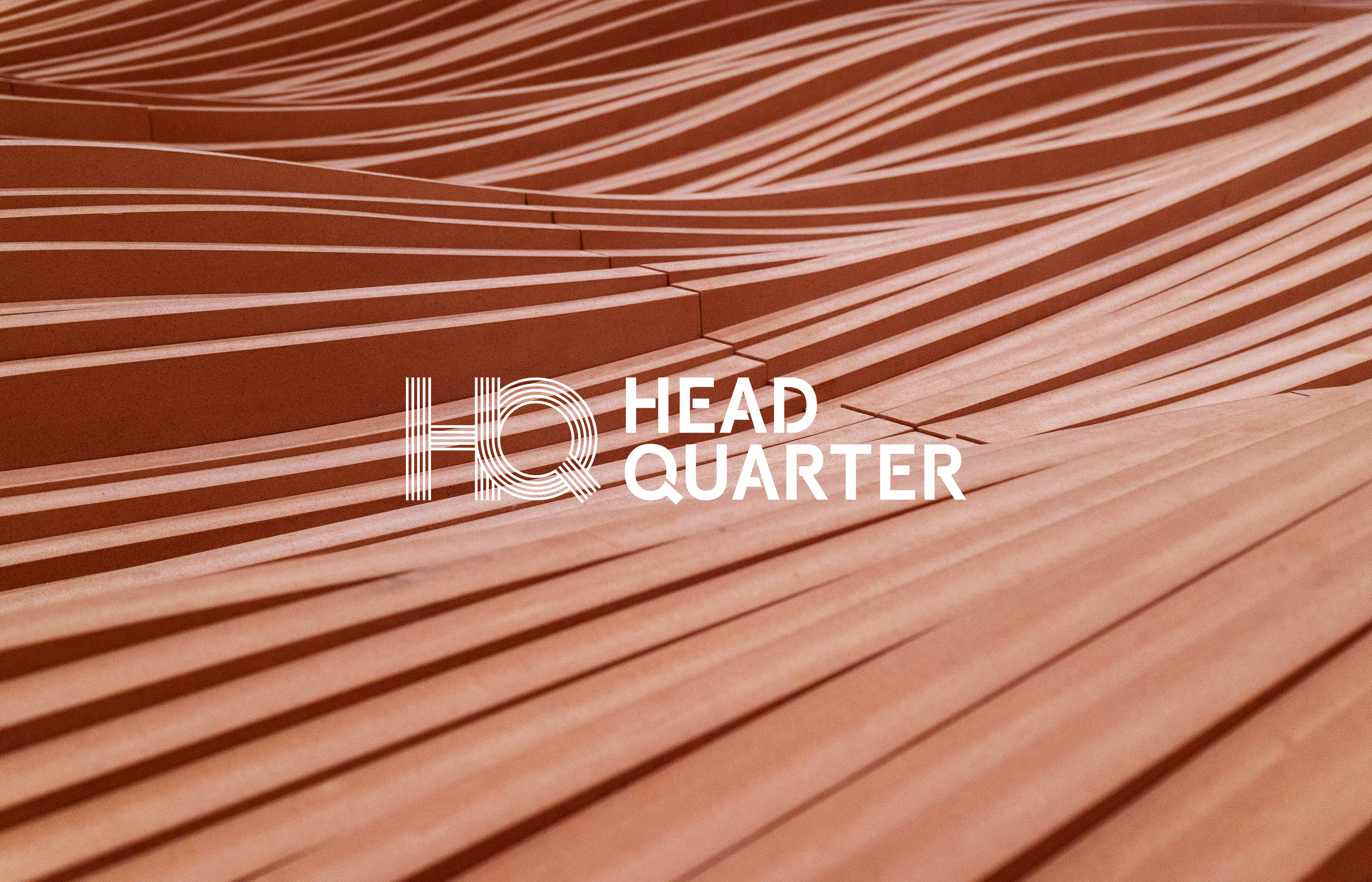
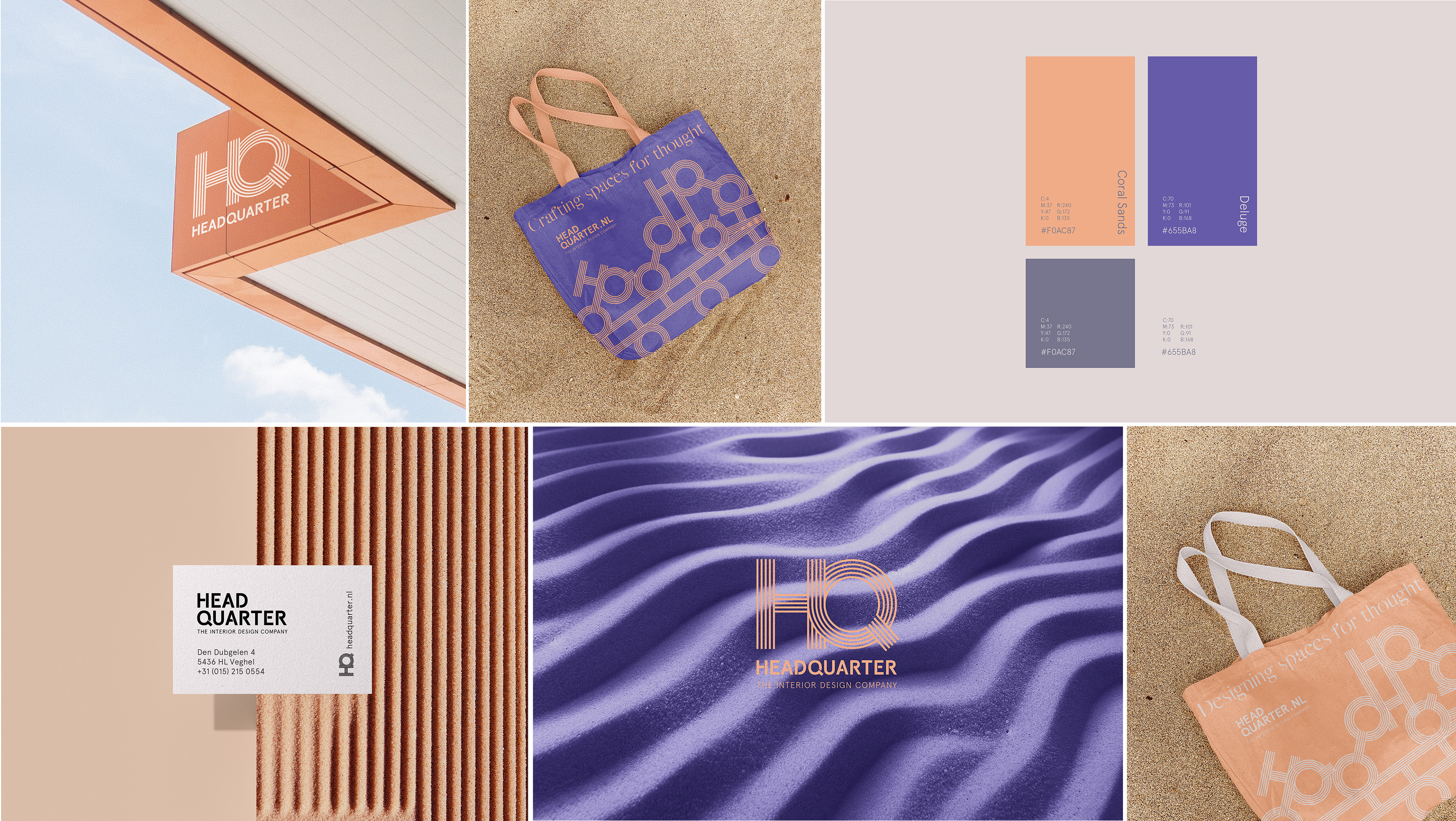
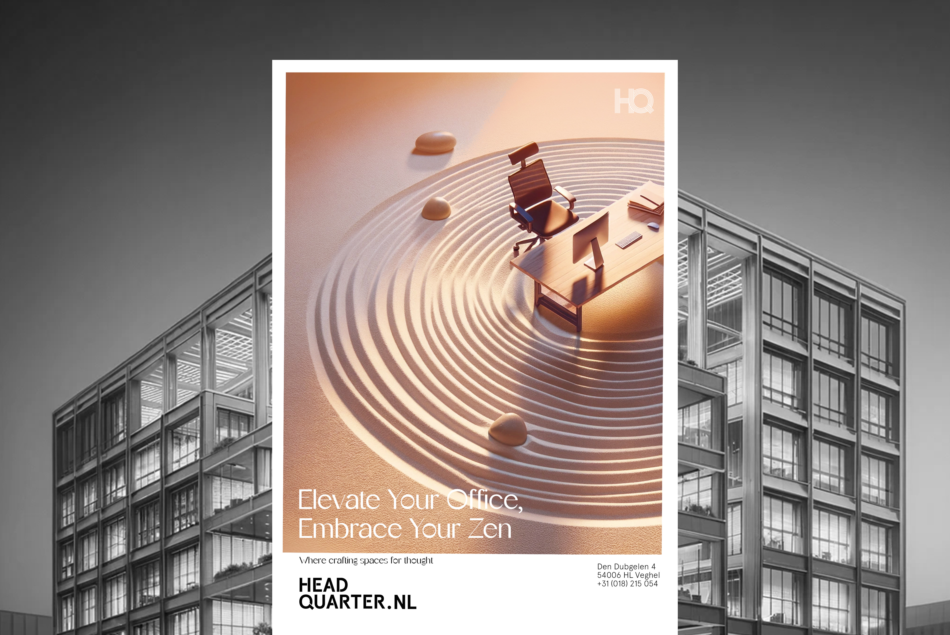
I've created a visual identity that encapsulates the essence of mindfulness and minimalism, distinguishing the brand from its competitors. I've chosen a soothing light coral sandy tone, paired with the contemplative hues of dark purple and blue, to evoke feelings of tranquility and balance. The typography is sleek and sophisticated, reflecting the brand's dedication to simplicity. A unique brand mark inspired by the raked lines of a Zen garden, versatile across various media digital platforms to physical packaging—has been devised. This design is adaptable and scalable, ensuring a consistent and coherent brand presence across a multitude of platforms and touchpoints.
I've created a visual identity that encapsulates the essence of mindfulness and minimalism, distinguishing the brand from its competitors. I've chosen a soothing light coral sandy tone, paired with the contemplative hues of dark purple and blue, to evoke feelings of tranquility and balance. The typography is sleek and sophisticated, reflecting the brand's dedication to simplicity. A unique brand mark inspired by the raked lines of a Zen garden, versatile across various media digital platforms to physical packaging—has been devised. This design is adaptable and scalable, ensuring a consistent and coherent brand presence across a multitude of platforms and touchpoints.